Reviews
Glean Review - The Enterprise AI Platform Built On Your Own Data
Glean has no trial and no self-serve signup, so we dug into what's public instead: connector specs, the agent library, and a rate card almost no enterprise vendor publishes.
We've tested Carousel Maker, an AI carousel maker for LinkedIn that turns one sentence into a finished, export-ready slide deck without opening a design tool.
Welcome to this Carousel Maker review ✨
Carousel posts are the format everyone tells you to post on LinkedIn and almost nobody keeps up with. The reason isn't the writing. It's everything after the writing: opening a design tool, picking a template that doesn't look like a school project, retyping your copy into eight text boxes, discovering slide four has a widow, exporting, realising the aspect ratio is wrong, exporting again.
Carousel Maker attacks that gap specifically. It's built by Simonas Petkevicius and Justas Markus, who describe the same loop in their own words on the site: write in one tool, design in another, fight the templates, question your life choices. Their pitch is a single workflow instead: describe the idea, get a polished deck, export a clean PDF.
The founders asked me to look at three things in particular: whether it's actually simple, whether it's actually fast, and whether it really works with no design skills. So I went in as a first-time visitor with no account, typed one sentence into the box on the home page, and followed it all the way through to a downloaded PDF. Here's what happened.

There is no sign-up wall. The home page is a single text box with a Create button, and four suggested prompts underneath ("5 LinkedIn growth tips", "Product launch carousel", "Startup pitch deck", "Productivity habits") in case you're staring at it blankly.
I typed "5 mistakes indie founders make when launching a product on a directory" and pressed Create. It dropped me straight into the editor, offered a nine-step tour that I skipped, and had a finished seven-slide deck on screen in well under half a minute.
What came back was better than I expected. Not just five headings and some filler, but an actual structure: an intro slide with the tagline "LAUNCH POSTMORTEM" and the hook "5 Ways Founders Waste Their Launch", five numbered mistake slides, and a closing "YOUR TURN" call to action. The copy had opinions. Slide two, on unclear taglines, wrote its own example: "AI-powered synergy platform" tells me nothing. Say what it does in plain words: "Turn Slack threads into help docs." Slide five, on treating launch day as a finish line, added a four-item checklist I hadn't asked for.
It also varied the layouts by itself. Some slides are icon plus text, one is a split with a stock photograph down the left side, one is the checklist. That variety is what stops a carousel reading like a slide template with the words swapped out.

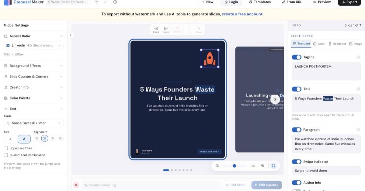
The editor splits into three columns and the split is the whole reason it stays manageable.
On the left is Global Settings, and everything there applies to the entire carousel at once: aspect ratio, background pattern, slide counter and corners, creator info, colour palette, and text. On the right is Slide Style, and everything there applies only to the slide you're looking at: tagline, title, paragraph, swipe indicator, author info, background image, floating image. The middle is the canvas, where clicking any piece of text turns it into an editable field in place.
That division does a lot of quiet work. In a general design tool, "make all my headings navy" is a selection problem. Here it's one click in the left column. I picked a dark navy trio from the Colour Palette panel and all seven slides restyled at once, instantly, with no dialog and no waiting. The palette panel offers preset trios grouped as Dark, Light, Vibrant, Pastel and Muted, and underneath, three hex fields for your own background, text and accent colours if you have brand values to type in.

One honest catch: the restyle is not contrast-aware. My tagline "LAUNCH POSTMORTEM" was a muted blue on a light background, and after the swap it was a muted blue on dark navy, which is close to unreadable. It's a five-second fix once you spot it, but the tool won't spot it for you.
Typography works the same way. The Fonts control opens a picker of roughly seventy pairings, sorted into Featured, Classic, Modern, Impactful, Playful, Creative, Handwritten and Techy, each shown as a live specimen with real sample text rather than a font name in a dropdown. You are choosing a look, not a typeface, which is exactly the right level of decision for someone who does not want to think about typefaces.

The aspect ratio dropdown is the other place the "one workflow" claim earns itself. It carries eleven presets grouped by destination: LinkedIn at 4:5 and 1:1, Instagram feed at 4:5 and 1:1, Instagram Stories at 9:16, TikTok at 9:16, Threads at 4:5, three video sizes and PowerPoint at 16:9. I switched from LinkedIn 4:5 to TikTok 9:16 as a test and all seven slides reflowed to 1080 by 1920 immediately, text and all. That's the resizing step that normally eats twenty minutes.
Generation is genuinely fast. One sentence to a finished seven-slide draft took seconds, and every styling change I made after that was instant, because it's all rendering in the browser.
Export is the slow part. Exporting my seven slides to PDF ran slide by slide behind a progress bar ("Exporting slide 3 of 7...") and took a couple of minutes in my session. Not painful, but it's the one place where "in minutes" is doing real work in the marketing copy, and it's worth knowing before you sit there wondering whether it has hung.
The output itself is better than the wait suggests. The exported file is a seven-page PDF, one page per slide, and each page is a full-bleed image at 2160 by 2700 pixels. That's double the 1080 by 1350 the dialog advertises, so the slides stay crisp when LinkedIn re-compresses them. The trade-off is that the text is baked into the image rather than sitting in the PDF as selectable text, which is normal for this category but does mean nothing in your carousel is copyable or screen-reader friendly.

Exporting without an account stamps a small watermark pill carrying the product's web address onto the slides. Interestingly it left my first slide clean and marked the rest, so the hook slide is unbranded even on the free tier. Creating a free account removes it.
There are fifty templates in the library, filterable by Modern, Minimal, Bold, Futuristic and Playful, and each one is shown as a filmstrip of its actual slides with a name, a one-line description and a slide count. "Market Data Report, dark editorial data deck highlighting standout market statistics, 6 slides" tells you far more than a thumbnail grid does.
There is a catch worth flagging clearly, because it isn't what the four-step diagram on the home page implies. Applying a template does not re-skin the deck you already have. The confirmation dialog says it plainly: "This will replace your current carousel with the selected template. This action cannot be undone." So templates are a starting point, not a theme switcher. If you generate first and browse templates second, as the marketing flow suggests, you will lose your copy. Pick the template first, or restyle with the palette and font controls instead.

Per slide, the Slide Style panel offers four layout modes: Standard, Emoji, Headshot and Image. Switching my intro slide to Image split it into a photo column and a text column instantly, with Browse, Replace and Remove controls for the picture. The Browse button opens a stock library drawing on Unsplash and Pexels, though that one is behind a free account.
The feature I liked most is the least flashy. The Preview button renders your carousel inside a mock LinkedIn feed post, complete with avatar, timestamp, swipe arrows, dot pagination and the Like, Comment, Repost and Send row. You see the thing as your audience will see it, at the size they'll see it, before you commit. For a carousel maker for LinkedIn specifically, that's the check that actually matters, and most tools make you post to find out.

So: does it work with no design skills? Yes, with a caveat. You can't produce something ugly by accident, because you're never given the tools to. But you can produce something slightly off and not notice, and I did. On the checklist slide, the global centre alignment centred each line individually, which left the checkbox icons in a ragged column instead of a straight edge. Switching alignment to left fixes it. The tool gives you good defaults and no guardrails, so a fifteen-second look at each slide before exporting is still worth it.
A few things worth knowing that don't need their own section:
The free tier is real: you can build and export carousels without paying or signing up, and the only cost is the watermark. Paid plans unlock the AI writing, the stock library, the animations, and clean exports.
Prices are in US dollars.
| Plan | Price | AI credits | Notes |
|---|---|---|---|
| Free | $0 | Enough for one generation in my anonymous session | Watermarked exports, no stock photos or animations |
| Monthly | $14.99 / mo | 50 per month | Unlimited carousels, all templates, custom branding, priority support |
| Yearly | $59.99 / yr | 50 per month | Everything in Monthly, works out at $5 a month |
| Lifetime | $199 once | 100 | Everything in Monthly, plus all future updates |
Three things to read carefully. First, credits are only spent when you ask the AI to write for you. Building manually, restyling and exporting cost nothing, which is a fairer line than most tools draw.
Second, the 14-day money-back guarantee is advertised as "zero risk" but the FAQ narrows it: you're eligible for a full refund if you haven't used any AI credits. Given that the AI generation is the reason most people will buy, that's a meaningful condition rather than a footnote.
Third, the feature lists don't quite line up. "No watermarks" is spelled out on the yearly and lifetime plans but not on the monthly one, and the lifetime plan's 100 AI credits carry no period where the other two say "per month". Both read like copy oversights rather than real differences, but I'd confirm before committing $199.
For positioning: the LinkedIn content suites like AuthoredUp and Taplio bundle carousels into a broader analytics and scheduling product, and Canva gives you infinite control at the cost of doing the design yourself. Carousel Maker sits between them and does one job. If you already pay for a suite, you probably don't need this. If you don't, this is a much smaller thing to buy.
It's a strong fit if you are:
It's the wrong tool if you need pixel control. There are no free-form shapes, no layers to speak of, no custom grid. The templates and layouts are the product, and if your brand guidelines are strict enough that you'd fight them, you'll be happier in Figma. It's also worth noting the whole thing runs anonymously in the browser, which is great for trying it and less great if you want a permanent library of past carousels.
That's the end of this Carousel Maker review. The three claims the founders wanted tested mostly hold. Simple is the strongest: the global-versus-slide split makes the editor legible in about a minute, and one click really does restyle a whole deck. Fast is true for everything except the export. No design skills needed is true in the sense that matters, which is that the floor is high, even if the ceiling is low and the tool won't catch a contrast problem for you.
What sold me more than the AI was the LinkedIn preview and the aspect ratio switcher. Those are the two steps that usually happen outside the design tool, in your head or in a second app, and folding them in is what actually turns four tools into one.
What I liked:
Things to keep in mind:
If posting carousels is something you keep meaning to do and never get round to, Carousel Maker removes most of the reason why.